top of page


Business Overview
On The Go LA is a full-service food truck rental company that provides short-term rental of their trucks in addition to logistics planning, social media marketing and menu optimization for their customers.
Through early meetings with our stakeholders we identified their overall business goals and how to properly utilize the website to serve as a resource and means to achieve them.
Current Site Analysis
In order to identify the pain points that the users were experiencing when accessing our clients site, we began to explore the site and performed a task analysis.
The task was to find different ways to book the food truck.
Another task performed was to try and see the truck schedule from the foodie's perspective.


Current Site Overview & User Flow


Pain Points
-
The current state of the website lacked sufficient information about the business' services and process or a way to book a reservation directly.
-
On The Go LA spent a huge amount of time on the backend via email and telephone calls with potential customers to address specific questions about their services as well as the process for onboarding them once they chose to book a reservation.

Product Strategy
Our strategy was to implement these missing essential pieces as part of the minimum viable product in our website redesign and present an easy to use, streamlined process to book a reservation for the customer experience.
Discover & Define
To start our research process, we had to learn about our past and potential users' experiences, struggles, pain points and successes.
I interviewed two past customers to gather information regarding their experience with the booking process of On The Go LA.
My team continued by interviewing two restaurant/catering business owners with no food truck experience to learn what a future customer might like to see before renting our food truck.
Together we combined all the data to create an affinity map and synthesize all the information. From our key findings we created a user persona for whom we considered and designed the website for.
Affinity Mapping

Key Findings
-
Our users have little to no experience or knowledge about food truck renting or operating.
-
They are open to learning/using a short-term food truck rental service.
-
They have revenue and profit decline in their business related to the pandemic.
-
Users have questions and concerns that need to be addressed before they are able to commit to booking a food truck rental reservation.
-
They need a quick and easy way to book and/or contact the business and do not wish to wait 24 hours for a response.
-
The current state of the website doesn't gear them toward booking a reservation.
User Persona
After synthesizing the information obtained through the interviews, we collected the most common patterns and created a user persona.
This persona named Rebecca allowed us to create the problem and solution statements that would guide us towards the solution.

Problem Statement: Rebecca needs a way to increase her customer reach and profitability due to the declining sales in her food business impacted by the negative economic effects of COVID-19.
Solution Statement: We believe that providing Rebecca with a short-term food truck rental packaged with a customized plan of logistics, marketing, equipment and resources, it will allow her to increase her business' exposure and revenue with a simple online tool.
C & C Analysis
To be able to provide the best experience for or users, we performed Comparative and Competitive Analysis of companies with a great user experience on their site.
This allowed us to learn what the competition is doing well and not so well, and also helped us to implement the best design for our site.

Competitive Analysis

Comparative Analysis
Competitive Analysis
1/2
Design Phase
We wanted to create an easy, seamless flow for our users and wanted to present information in a linear fashion in a type of way where they could intuitively learn about the company by scrolling down the home page while having options to learn more about specific features or processes or simply book once they felt ready to do so.
The website serves two purposes; to educate the potential user about the value proposition of the business and their services and second is to be able to easily book a reservation through a check-out process.
Our strategy was to present information in short, digestible bits and sections while using language in copy that was welcoming, personal and speaking directly to the user. We knew social proof, testimonials and reviews as well as an "About us" section on the website would help connect and earn trust with our users.

Sketches Page
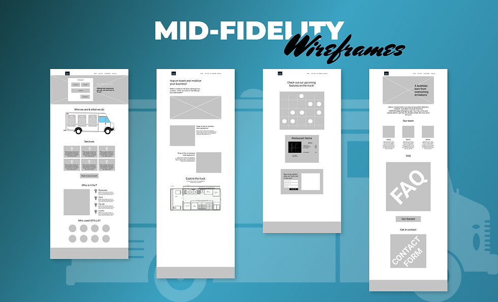
Mid Fidelity Wireframes

Journey Map
Sketches Page
1/5
Usability Testing
Our usability testing uncovered UI elements that needed further tweaking and improvement. Feedback included font and element
re-sizing for increased readability as well as styling considerations.
There was also some confusion about the term "schedule" in the global navigation and what that meant "to book" or an actual schedule or calendar.
Overall users were able to successfully complete all tasks and ultimately book a reservation using the high fidelity prototype.

Reflection
This was my first experience as a project manager while also being the product designer and part researcher with a real client. It was a great opportunity to learn from the market and to test my leadership skills while guiding the team to meet the deadline.
-
It’s extremely important to pay close attention to details regarding the client's goals.
-
Understanding how companies with great user experience keep their customer base happy.
-
This project overall was a defining block in my career, many of my past skills were tested, such as adapting and overcoming situations and being able to switch gears at a fast pace.
-
To be able to see our client happy with our deliverables and implemented our design to their updated site is one of the milestones accomplished during this pandemic era.
bottom of page